Most of what we write about here is a new build, a new client, a problem we hadn't solved before. This one is different, and we think it's worth writing about precisely because it's different.
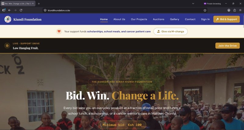
We've worked with the Danson and Serah Kiundi Foundation since 2023. Their platform runs ongoing online auctions, everyday products like clothing, electronics, and books, where every bid funds one of three programmes: scholarships for students in Nzaui Subcounty, daily school meals at Nduundune Primary School, and support for cancer patients and their families across Kenya. It's a genuinely good model. People get a product at a fraction of its retail price, and the Foundation gets sustained funding for real, ongoing work, not a one-time donation drive that fades after a few weeks.
We didn't build this platform last month. We built it years ago, and we've maintained it since. So when we sat down recently to give it a fresh look, the project wasn't "what should this be." It was "what should this still be, now that we know more than we did when we first built it."
There's a particular kind of project that doesn't come up often in conversations about software development: returning to something you built yourself, years later, with better tools and a sharper eye, and deciding it's time to revisit it.
It's a strange position to be in. You're not inheriting someone else's decisions and wondering why they made them. You already know why every decision was made, because you made them. The difference is simply that two years have passed, your own standards have moved, the tools available to you have improved, and the platform itself has grown, more auctions, more programmes, more people using it regularly. Maintaining the exact same visual approach indefinitely, just because it was the original approach, starts to feel less like consistency and more like neglect.
So over a recent stretch, we treated the Kiundi Foundation's platform the way we'd want any client to eventually treat their own software: not as a finished artifact to leave untouched, but as something that deserves to keep pace with how good it could actually be.
The first and most foundational piece of this work wasn't visible on any single page. It was building one consistent design system, a shared set of colours, spacing, type sizes, and reusable components, and applying it everywhere, in place of the utility-first approach we'd used originally.
When we first built this platform, we used Tailwind, a utility CSS framework where you style things by stacking small, single-purpose classes directly in your markup rather than writing custom styles for each element. It's a popular approach for good reason. Tailwind generates a CSS file containing only the classes you actually use, so performance was never the issue, the styling never made pages slower to load.
The issue showed up somewhere else: in how the code actually read, and in how consistent the platform stayed as it grew. A single element styled with Tailwind can carry a long string of classes stacked together to get the exact look you want, which makes the underlying markup harder to read at a glance, you're parsing a list of small utilities rather than seeing a clearly named, purposeful style. And because each page's styling lived directly in that page's own markup, keeping things visually consistent across a growing platform meant remembering, by hand, which exact combination of classes produced "the same look" everywhere else, an approach that holds up fine for a small site, and gets progressively harder to keep tidy as a platform keeps growing in size and in the number of people touching the code over time.
So we moved away from that approach entirely. We built a custom design system instead, one set of named, reusable components and design tokens, colours, spacing values, type sizes, defined once and referenced everywhere. A button is .btn, not a string of a dozen utility classes repeated slightly differently on every page that has one. The visual language now lives in one place. Every page draws from it, rather than redefining its own version of "the same" style independently.
The practical result is something visitors likely won't consciously notice, and that's the point. A platform that feels coherent doesn't draw attention to its own design. It just feels trustworthy. But for us, maintaining the platform going forward, this change matters just as much as anything visitors will see. Consistency stops being something we have to remember and starts being something the system enforces on its own.
When someone lands on a page to bid on, say, a pair of shoes or a set of earphones, there's a question sitting underneath the surface almost immediately: where does my money actually go if I do this? Previously, the cause behind an auction was explained, but further down the page, after someone had already taken in the product details first.
We moved it up. Now, right under the product name, before anything else, there's a direct line connecting that specific auction to the specific programme it supports, scholarships, school meals, or cancer patient care. It's a small placement change, a few lines higher on the page, but it answers the question before someone has to go looking for the answer themselves. We think that matters more than it sounds like it should. People supporting a cause want to know their support is going somewhere real, and they shouldn't have to dig for that confirmation.
A second thread running through this work was language, not the cause-related language, but the everyday copy across the platform.
The platform originally referred to each auction as a "round." It's an understandable word choice, and it made sense internally, but to someone visiting for the first time, "round" carries a slight game-like connotation that doesn't quite match what's actually happening: a real bid, with real money, for a real product, funding real work. We shifted that language to "online auction" and "session" throughout the site, in headings, in navigation, in the explanation of how things work. It's a small wording change, but first impressions are built from exactly these kinds of small signals.
We made similar adjustments to the payment experience. Error messages that once said something generic, "please enter a valid phone number", now say specifically what's expected, including the correct format. A success message that previously disappeared after five seconds now stays visible long enough to actually register before fading. We also added a quiet layer of spam protection to the contact form during this round of work, the kind that works invisibly in the background and only affects automated submissions, so real visitors never notice it's there at all. None of these changes are dramatic on their own. Together, they reduce the small moments of friction or confusion that quietly erode trust in a platform, even when nothing is actually broken.
We don't think this kind of project gets talked about enough in our field. New builds get attention because they're visible and dramatic, a website goes from not existing to existing. Returning to something that already works and asking "is this still good enough" is quieter, but we'd argue it matters just as much, especially for a platform that real people depend on regularly, not just once.
The Kiundi Foundation's platform didn't need to be rebuilt. It needed someone willing to look at it honestly, two years in, and decide that the standard it should be held to is the standard we hold ourselves to today, not the standard we held ourselves to when we first built it.
We think that's true of most software that sticks around long enough to matter. The work doesn't end at launch. It just changes shape.
The Danson and Serah Kiundi Foundation's platform is live at kiundifoundation.co.ke. We've been their development partner since 2023, and continue to design, build, and maintain software for organisations and businesses across Kenya. Get in touch to talk about your project.
No comments yet
Be the first to share your thoughts on this article!